During my time at Billy Blue, I had the incredible opportunity to delve into a project that truly sparked my creativity and passion for design. I set my sights on rejuvenating the brand identity of an existing festival, and the National Folk Festival stood out as the perfect canvas for my creative exploration.
With a heart full of enthusiasm and a mind brimming with ideas, I embarked on a comprehensive journey to reimagine and revitalize the festival’s visual presence. My goal was to infuse new life into the brand, ensuring that every piece of collateral resonated with the festival’s vibrant spirit and rich heritage.
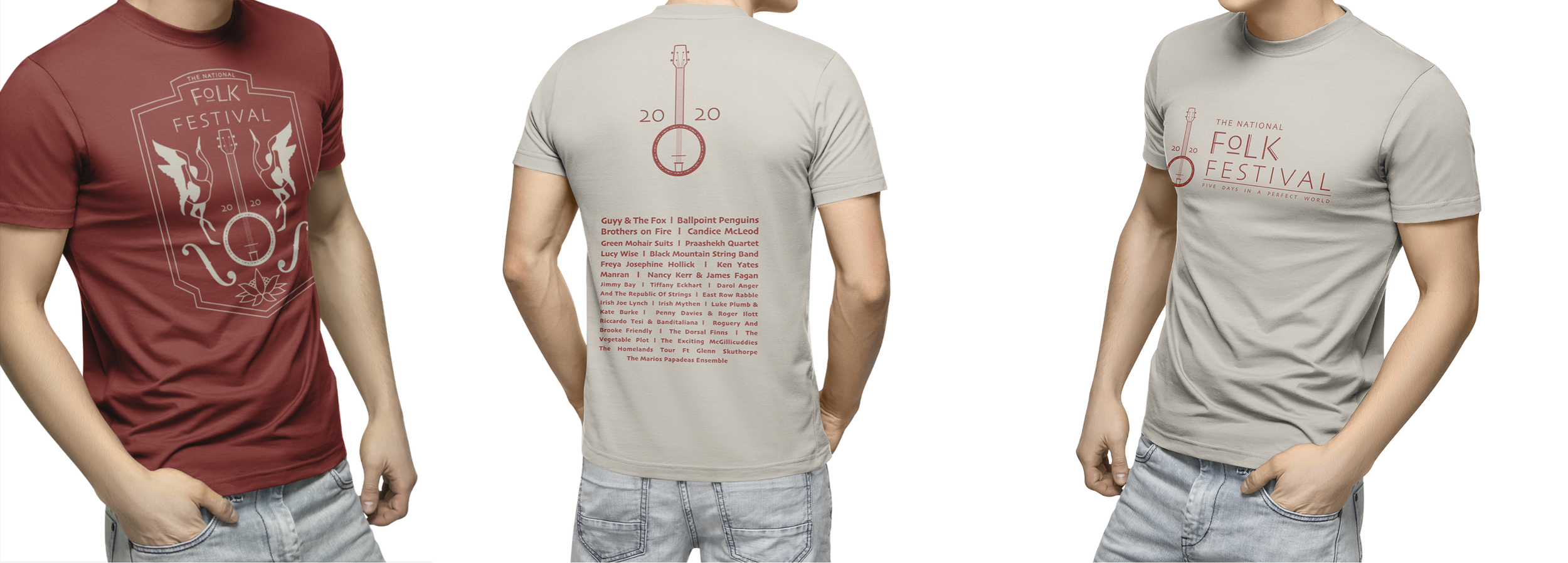
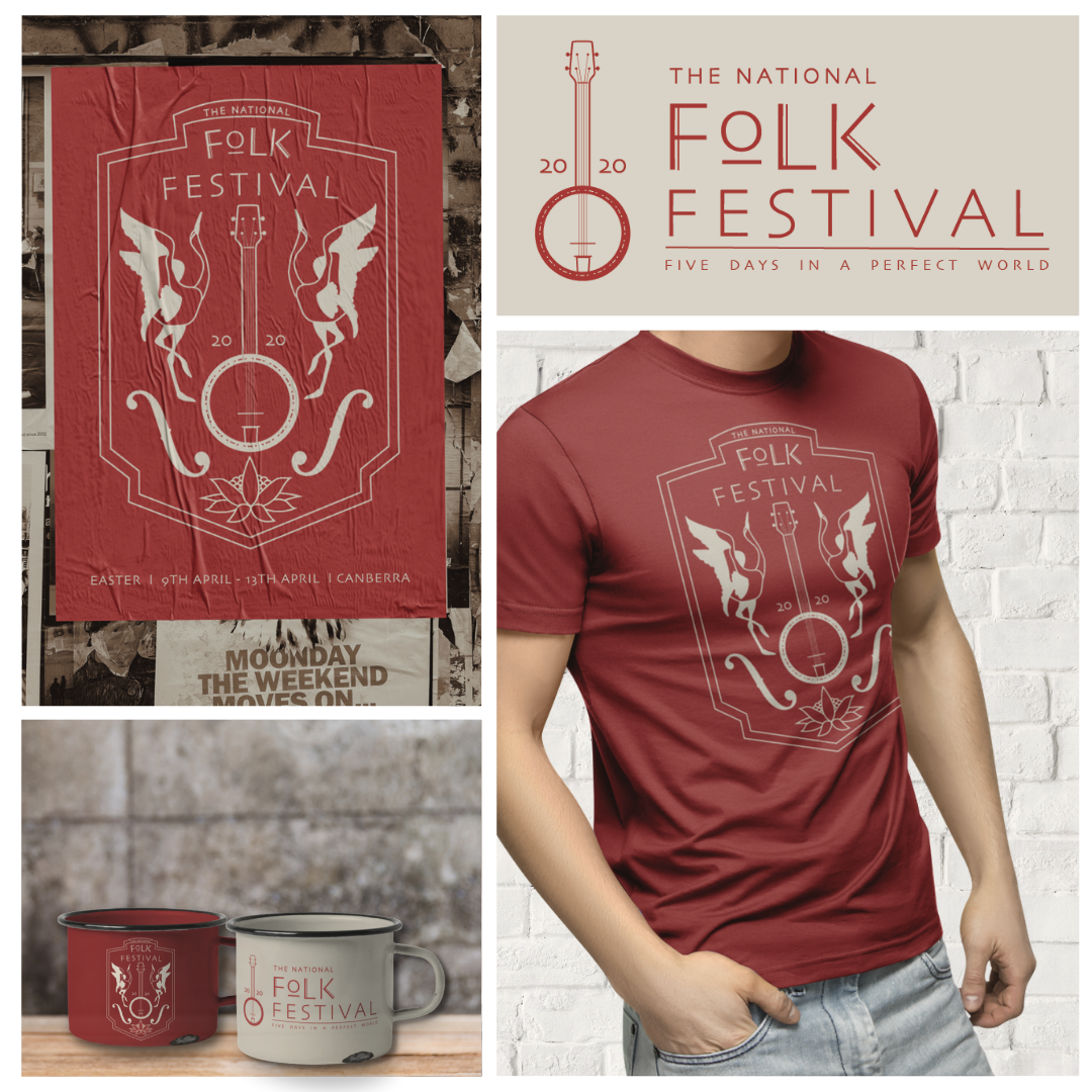
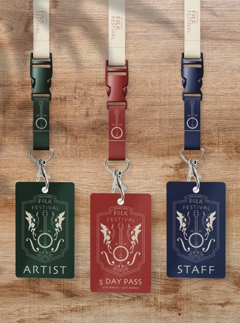
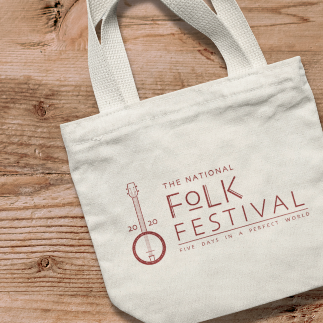
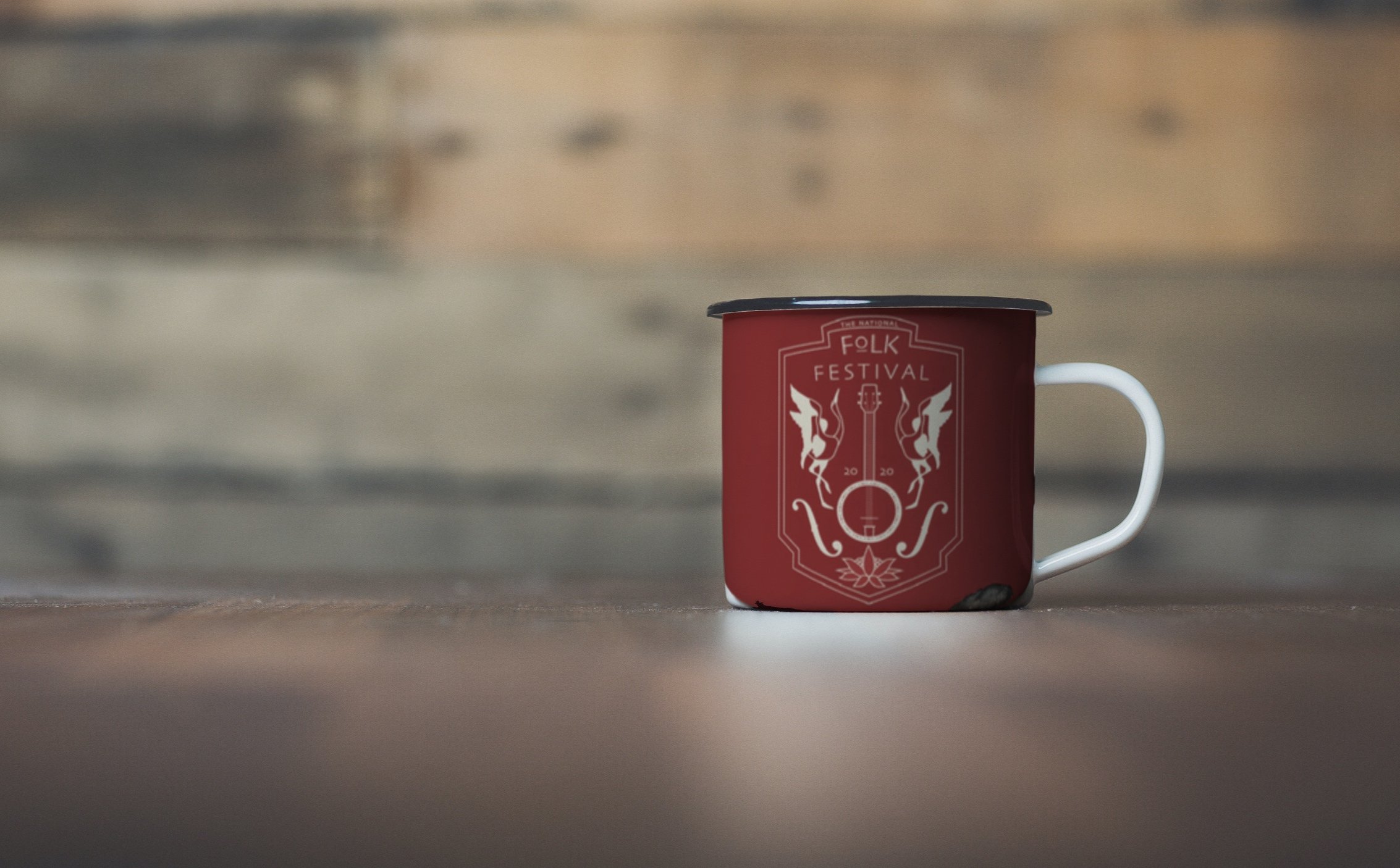
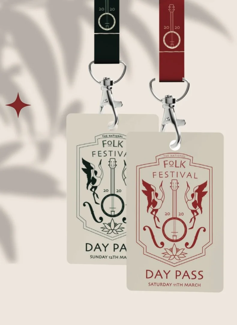
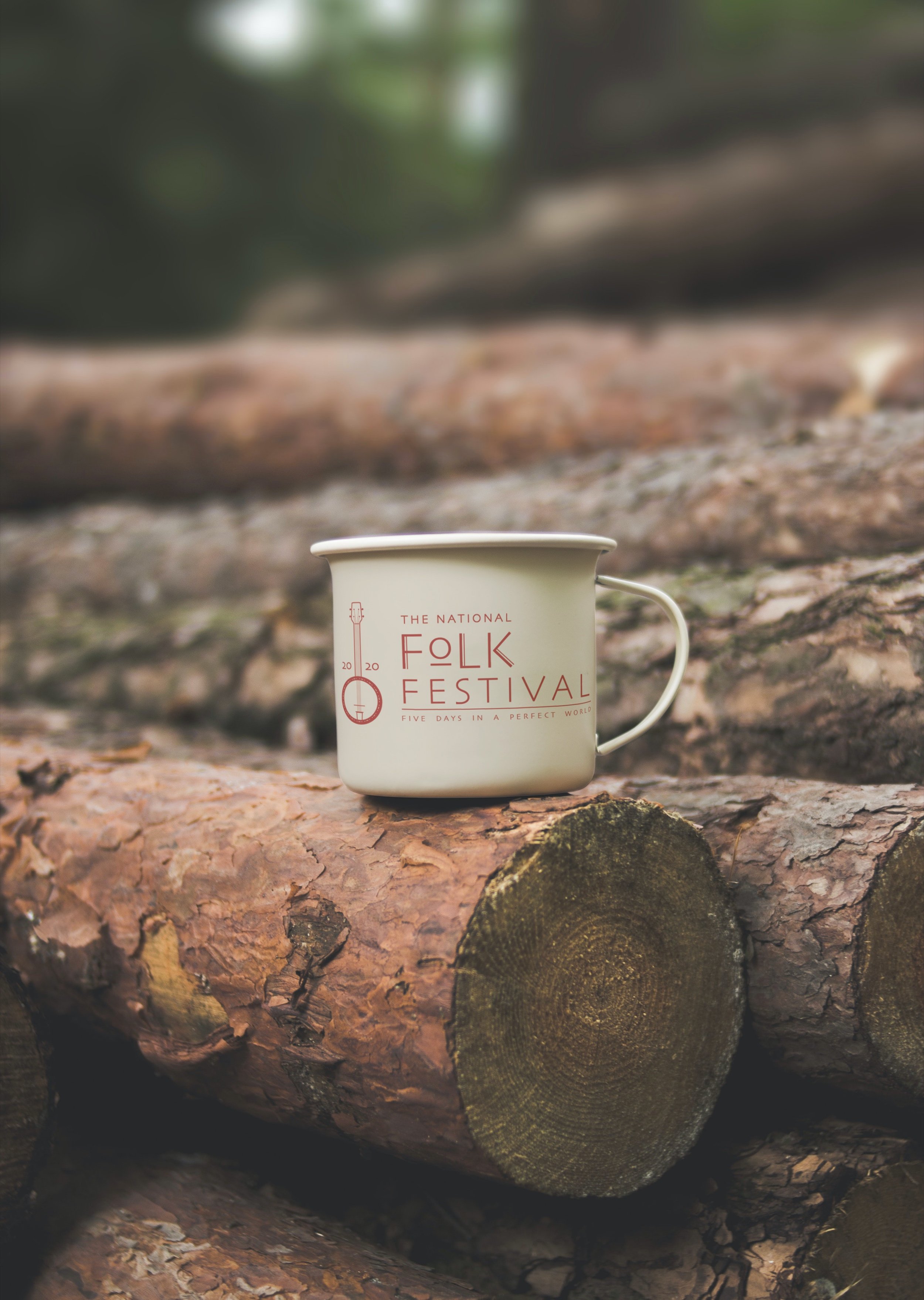
The project encompassed a wide array of branding materials, each designed to capture the essence of the festival and create a cohesive and captivating experience. From the logo, which served as the cornerstone of the new identity, to web banners, app icons, and a variety of promotional items such as lanyards, t-shirts, posters, totes, and mugs – every element was crafted with precision, care, and a deep love for the arts.
The end result was a refreshed and revitalised brand identity that not only paid homage to the National Folk Festival’s storied past but also paved the way for a new and exciting future. It was a project that not only honed my skills as a designer but also deepened my appreciation for the power of branding in creating memorable and meaningful experiences.
project Logo Design / Rebrandingapp used Illustrator / Photoshop / indesignmy role concepts / Graphic Design