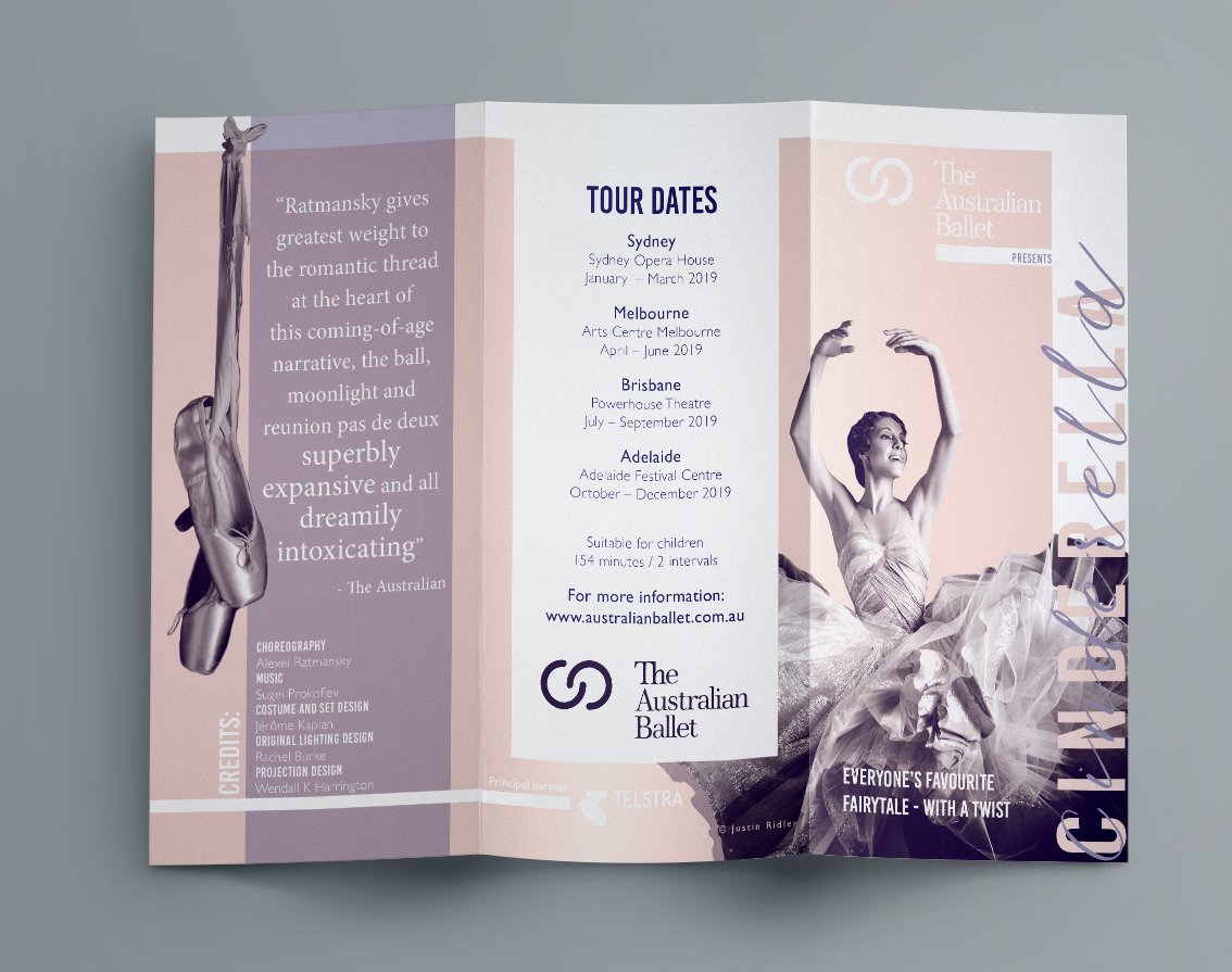
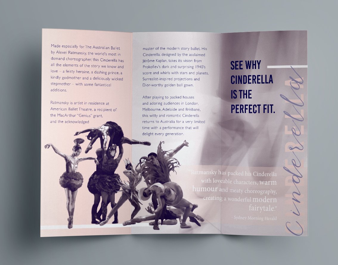
During my studies, I took on a project to create a DL size promotional brochure for the Australian Ballet's upcoming tour, adhering to a duotone color palette to minimize print costs. Embracing this creative challenge, I meticulously selected a color scheme that resonated with the ballet’s elegance and dynamism, ensuring every design element aligned harmoniously. The process involved immersing myself in the world of ballet, aiming to encapsulate the excitement of the tour in a visually striking and cost-effective manner. The final product was a testament to thoughtful, efficient design, showcasing that creativity can indeed thrive within specific constraints.
project Brochure Layoutapp used Photoshop / InDesignmy role graphic design / finished art